
Using Lines and Patterns Under the UC Davis Brand
Lines and Patterns Download
The lines and patterns are available as Adobe Illustrator files in this Box folder. Campus login required.
Our graphic line elements can be used both functionally and as a decorative element. Functionally, we use it to call attention to certain content. Linework should always be a secondary element that supports the design; it should never take over.
- Use .5pt-3pt. lines for letter-size (8.5 x 11 inch) print pieces. This rule of thumb can be scaled up proportionally for larger pieces. Ultimately, weight is variable, depending on the size and scale of the piece.
- Lines can be used in any color from the UC Davis color palette, as long there is sufficient contrast to the background for the lines to be visible.
- Always use the Butt Cap and the Miter Join settings. Alignment can vary based on the situation, but the only stroke types allowed are solid.
Open Frames
Open frames are a new way to call attention to certain design elements, like photos and text. They subtly represent how UC Davis is a place where ideas are open, extend beyond intersections, and provide a framework for understanding. Below are some ways this design concept can be used.
Keep lines to no more than 2pt thickness or what is similar to any text outline it comes in contact with.


Abstracted Star
The star on the university seal, representing the light of knowledge, has been abstracted and deconstructed, and rendered as several different line elements.

Using the star element
The star element is meant to bring attention to something, like the first example below, or as a sort of visual exclamation point like the second and third examples. It should never be seen as a logo or identifier, or be locked up with any text or any logos. Instead, it's more of a background element that enhances, never the focus of the design.


Using the single elements
The arrow element, pulled from the abstracted star, can be used to show forward movement or growth, like the first example below. The triangles element can be used to show upward movement or growth, like the second example.


Patterns
The elements of the abstracted star, as well as some from the successful "Expect Greater" campaign, are available as a series of patterns, seen below.
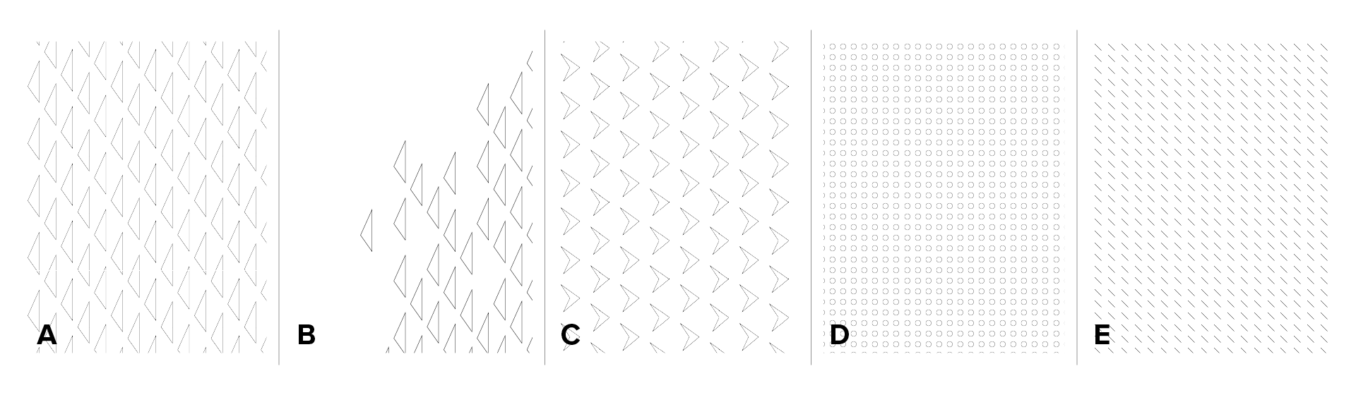
These patterns can be used in a number of ways, seen here in just a few examples.


